
Reports & Analytics
Navigate the embedded Power BI reports, interpret analytics, and interact with report visuals.
Reports & Analytics
The Reports module embeds a Power BI workspace that consolidates user, experience, and attendance metrics. Expect a loading spinner while the dashboard initialises, and ensure you have permission to view sensitive data before sharing screenshots.
Overview Page (1 of 9)
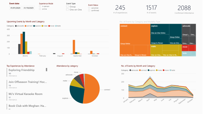
- Upcoming Events by Month & Category visualises future volume by program category.
- KPI cards for # of Experiences, # of Events, and Confirmed Attendance adapt to whichever date range you select.
- No. of Events by Category & Modality uses a treemap to show group versus one-on-one and online versus in-person distribution.
- Attendance by Category displays proportional attendance in a pie chart.
- No. of Events by Month & Category tracks the trend of event counts over time.
- Top Experiences by Attendance lists high-performing experiences for quick reference.
Location Insights (2 of 9)
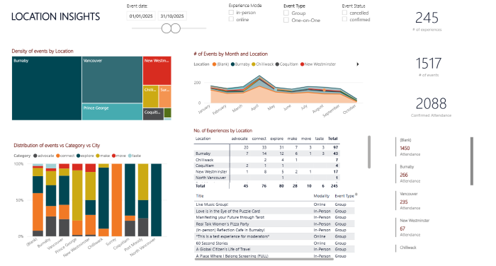
- Events by Location treemap highlights cities or regions with the most activity.
- Events by Month & Location line chart reveals seasonal patterns.
- Distribution of Events vs Category vs City compares categories across locations.
- Number of Experiences by Location table and KPI cards summarise totals.
Attendance Metrics (3 of 9)
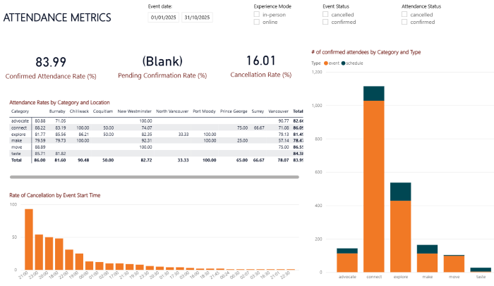
- Cards for Confirmed Attendance Rate, Pending Confirmation, and Cancellation Rate surface performance at a glance.
- The Attendance Rate by Category & Location matrix highlights strengths and gaps with colour cues.
- Confirmed Attendees by Category & Type compares participation by program type.
- Rate of Cancellation by Event Start Time shows which start times are prone to cancellations.
Experience Dashboard (4 of 9)
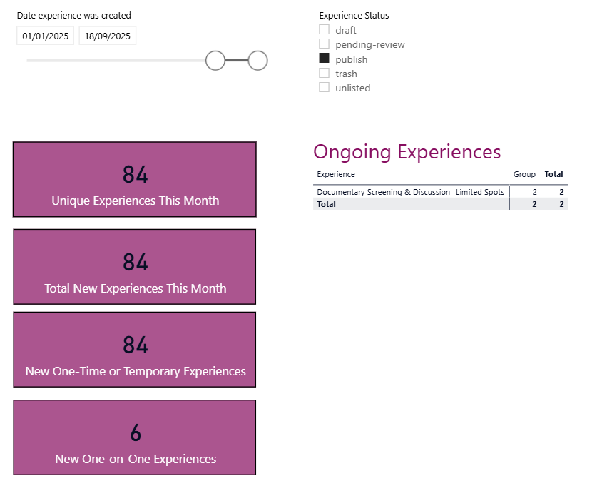
- Filters at the top let you focus on specific date ranges and statuses (Published, Pending Review, Draft).
- KPI cards track new experience activity, including Unique Experiences this Month and New One-time or Temporary.
- The Ongoing Experiences table lists active experiences with key metadata for follow-up.
User Engagement (5 of 9)

- Cards display Total Users and Average Engagement in Days.
- The User Engagement table organises participation metrics per user, including unique events attended and engagement duration.
- User Growth & Engagement Over Time visualises onboarding and retention trends.
- An ArcGIS map placeholder appears if the map integration is enabled; otherwise you can rely on the table and line chart.
Volume Data (6 of 9)
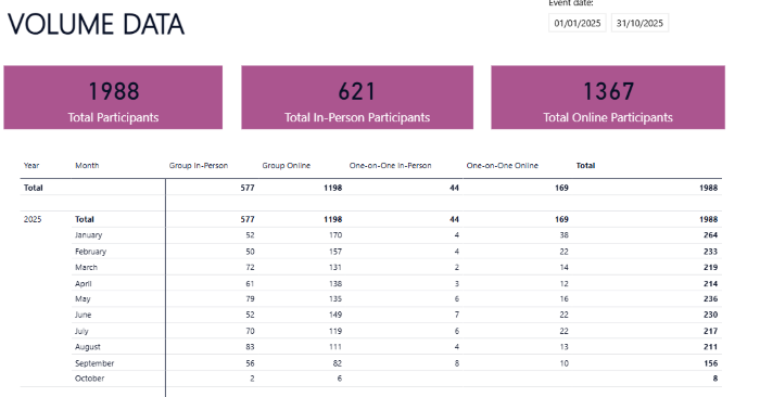
- Cards summarise Total Participants, Total In-Person Participants, and Total Online Participants.
- The Participants by Year & Month table outlines attendance across modalities, helpful for spotting seasonal demand or shifts between group and one-on-one programming.
Profile Analytics (7 of 9)
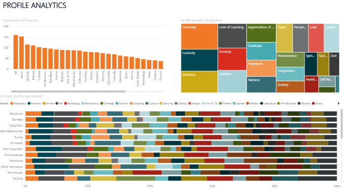
- Distribution of Interests shows how many users identify with each interest area (for example, creativity or love of learning).
- Profile Strength Distribution treemap visualises self-identified strengths or values.
- Number of Users by City & Interest connects geographic distribution to interest areas.
Content Evaluation (8 of 9)
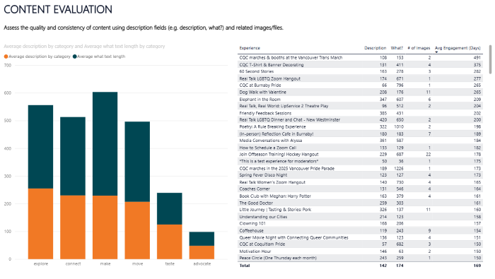
- Stacked bars compare the average word counts of descriptions and "what you’ll do" sections by category.
- The Experiences table includes columns for description length, what-to-do length, number of images, and average engagement duration, making it easy to target experiences that need richer content.
Host Compliance (9 of 9)

- Donut charts track Criminal Record Check, Phone Verification, and Welcome Verified status for hosts.
- Cards highlight overall totals, such as Compliant Hosts, Non-Compliant Hosts, Criminal Record Verification Rate, and Welcome Vetting Rate.
- The Host Compliance table lists each host with compliance indicators, enabling quick outreach.
General Interaction Tips
- Use the page navigation controls (for example, “1 of 9”) or arrow buttons to move between report pages.
- Adjust slicers such as date range, category, modality, or status before interpreting the visuals.
- Clicking any chart element cross-filters the rest of the page; use Ctrl-click for multi-select and clear selections by clicking blank space.
- Hover over charts to reveal tooltips with exact counts and percentages.
- Focus mode enlarges a visual for closer inspection; use the back arrow to return to the main page.